Science or Fiction Prediction: Getting a Statistical Edge

People sometimes say that if you're not sure what the answer is on a multiple choice question, you should guess c.  I've always wondered if such a system could be applied to the Science or Fiction section on The Skeptic's guide to the Universe (SGU) podcast.

What a multiple choice test may look like

What a multiple choice test may look like

Quick background for non-listeners:  The Skeptics Guide to the Universe is a super great science podcast that you should listen to.  Each episode, they play a game called Science or Fiction, where one host (usually Steve) reads science news items or facts, one of which is completely made up.  The others then try their best to determine which one is the fiction.

While it isn't practical to examine all of the multiple choice tests that have ever existed to determine if c is more likely to be correct, we can actually take a look at each round of Science or Fiction.  It turns out that they keep good show notes on the SGU's website, including each science or fiction item and whether or not it's true.

As of this post, there are 480 episodes, so it's not practical to get the data by hand, but since each episode's page is neatly organized on the website it only took a couple minutes to whip up a little scraping script with python and Beautiful Soup to get the data. (Interestingly enough, scraping through all of the pages I found a tiny mistake: Item #1 of episode 247 is missing a "1".  This broke my scraper the first time through.)

I only collected information about episodes where there were three science or fiction items (which is most of them), so that we can make a meaningful comparison:

Item 1 Item 2 Item 3
Frequency 128 119 133
Probability of Fiction 33.7% 31.3% 35.0%

So it appears that item 2 is fiction less often than items 1 and 3.  The question is, is it a "real" difference, or is it just part of the expected statistical background noise?  Basically, we're trying to empirically determine if Steve uses some sort of random number generator to determine which item will be the fiction each week. Doing a chi squared test tells us that there's a 67% chance of observing such a difference.

In other words: the frequencies are consistent with a uniform distribution, and you can't get a significant edge based on the item ordering.  Steve outsmarts us again!

I did the data collection and analysis with ipython, and you can check out the code here.

More Fun with OCN Server Data

This is a follow up to the previous post about tracking Overcast Network's (OCN) server activity.

A couple things:

  1. At the time of that posting, there were only a few days of data in the database.  Since then, the script has been churning away for the past few weeks, giving us a much larger sample.
  2. The original scripts spend most of the time juggling dictionaries and reshaping the data to plot.  This isn't particularly elegant.  This time around I'm using Pandas for the data preprocessing after restructuring the database.

In retrospect, it would have probably made more sense to store the information in an SQL database. I used MongoDB only because I had never used it before (my favorite reason), and the prospect of being able to dump python dictionaries right in seemed fun.  And I pretty much did just that - dumping dictionaries of data - which seemed simple enough at the time but ultimately led to processing complications later (see above).

eu-counts

With all of this in mind, I played with the data a bit in an ipython notebook, and so it only makes sense to display the code and results using the very cool browser notebook viewer.  Check them out here!  (If you aren't using the ipython notebook daily, you're blowing it. It's a lot of fun.)

As you can see from the plots, the player count varies quite a bit throughout the day, even with a very large spread of players across the globe.  This can cause some issues since many of the servers are designed with a certain number of players in mind.  OCN recently implemented dynamic servers, which turn on and off depending on the number and distribution of players online and will hopefully solve this issue.

Code and more graphs

Overcast Network and the Blue Team Advantage

Overcast Network (OCN) is a minecraft server network that features player vs. player (PvP) minigames.  There are a variety of gamemodes that take place on over 100 maps, where matches can last anywhere from a few seconds to a few hours.

The matches typically involve two teams of various colors, but the most common match up is red vs. blue.  This is signified through things like dyed armor and colored name tags.  Some people have speculated that, in certain situations, one team may have an advantage over the other.  Blue, for example, blends in better with water.  Red blends in better with things like lava and other reddish blocks, but seems to be, overall, an easier color to spot.  Some players even go out of their way to join one team color over the other, perhaps trying to take advantage of this.

Viridun

Viridun

Another potential advantage-yielding asymmetry is literal asymmetry in map design.  Most of the maps being played are symmetric for all teams - one team's side is either a mirror image or a 180 degree rotation of the other.  The map Viridun is the best example of an exception to this.  On Viridun, both teams have the same starting gear, but the map is asymmetric both spatially and in the distribution of potions hidden in various places.

The effect of these asymmetries can be tested by looking at a large number of matches and seeing who wins more often.  Perfect symmetry would be when each team wins a match 50% of the time (I'm only looking at maps with two teams here).  Of course, we can only look at a finite number of matches and so we'd expect some variation from 50%, but we can determine if this variation is within the expected range by using some basic statistics.

Results

Overall, blue won 49.685% of the matches (that sort of graph looks kind of familiar!).  This is consistent with no systematic advantage (or at least, no systematic advantage that is being exploited by players).  Breaking it down by gamemode, there is some variation, but none of the differences are statistically significant.

Looking at Viridun, however, we find that blue wins 66% of matches, which is statistically significant.  This is probably due to some combination of actual imbalances in the map and the fact that players who are very familiar with the map are aware of these imbalances and so are more likely to join the blue team, resulting in a better team.

Supporting Materials

 Data

Game Matches Blue Wins Χ2 V p
Overall 1270 49.6% 0.0504 0.0014 0.8224
Mini 450 48.4% 0.4356 0.0205 0.5093
CTW 107 57.9% 2.7009 0.2611 0.1003
DTC / DTM 85 49.4% 0.0118 0.0013 0.9136
TDM 38 55.3% 0.4211 0.0683 0.5164
Blitz 384 47.4% 1.0417 0.0532 0.3074
Viridun 142 66.2% 14.9015 1.2500 0.0001

Gamemode Glossary

  • CTW (Capture the Wool) - One team tries to capture wool blocks from the other team's side (capture the flag, basically).
  • DTC (Destroy the Core) - One team tries to leak lava from a team's core by breaking it.  A variation of this is DTM (destroy the monument), which involves breaking the blocks of another team's monument with no lava involved.
  • TDM (Team Death Match) - Teams try to accumulate the most kills and least deaths.
  • Blitz - Usually TDM, and you have limited lives.  A variation of this, Rage, includes weapons that kill in only one hit.
  • Mini - "Mini" versions of DTM, DTC, and CTW that have smaller team sizes and maps.

The real goofy vs. regular: A look at skateboarders in the SPoT database

In board sports, riders are "goofy" stance if they lead with their right foot and "regular" stance if they lead with their left. These terms seem to imply that one way is more "correct" or common than the other. I'm goofy, so I'd like to know just how goofy it is to be goofy. It turns out, a little bit goofy.

I checked out the Skatepark of Tampa (SPoT) skateboarder database, which has been maintained for 12 years and is probably the most extensive and detailed online.  The database consists of professional and amateur skateboarders who've been to SPoT for some reason or another.  Given that SPoT has been host to two of the largest annual contests in skateboarding since the mid 90's (the Tampa Pro and the Tampa Am), you can bet that the best have been through the doors. Note that in skateboarding, the term amateur (or am) doesn't necessarily imply that the person is less skilled than a professional - it only implies that the person doesn't have their name on a product yet.

SPoT Database Statistics

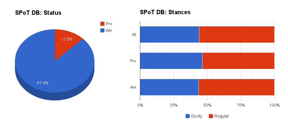
Of the 6,047 profiles examined, 12.6% are pro.   4,030 of these profiles had stance data, of which only 44% are goofy.  I personally find this a bit surprising, as I assumed it would be closer to 50%.  To put it mathily, a chi-square test indicated that the difference from 50% is statistically significant,   (where is Cramer's ).

Age
Average 22.79
Median 23

Many of the database entries also included age, which is summarized in the table.  Now, this doesn't necessarily mean that the average age of a competing skateboarder is 23 (I think that may be a tad high). To speculate a bit, I'd guess that the database, which has been maintained for 12 years, adds skaters regularly without deleting older ones.  Assuming that most of the ages are updated over time, the database will accumulate ageing skateboarders who aren't actually active anymore.  For more information about skateboarder age, see this Nerdsday Thursday post.

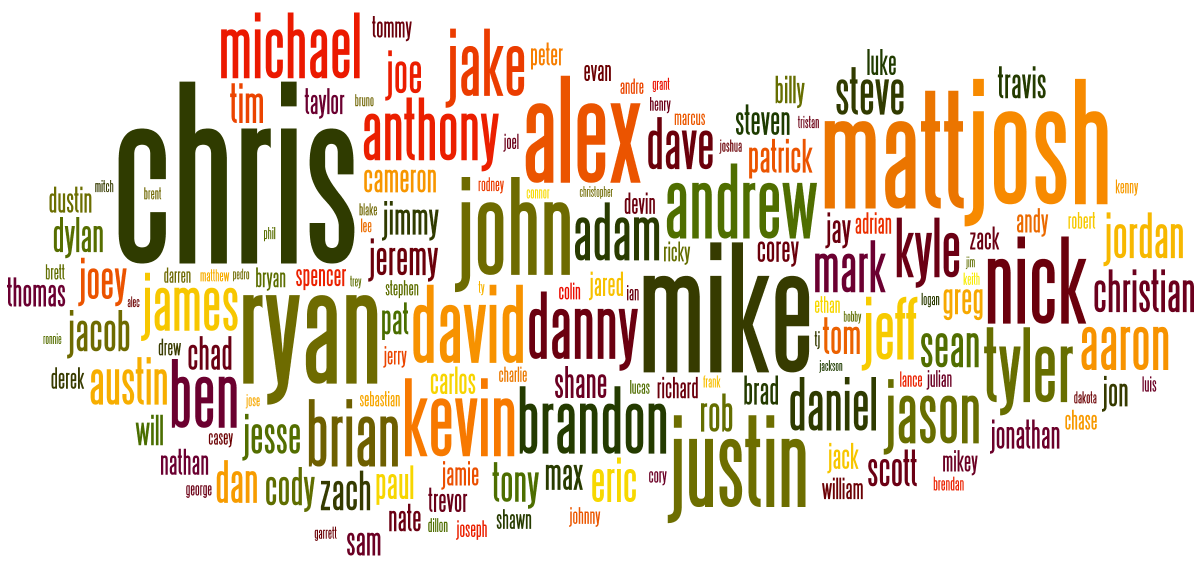
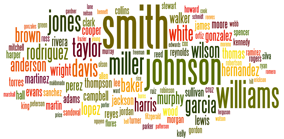
Also, word clouds are really pretty to look at so, why not, here are the most common first and last names in the database:

SPoT DB Common First Names

SPoT_last_namesNothing surprising here, but it does confirm my previous suspicion about the importance of people named "Mike" in the skate industry.  (Or maybe it's just a common name? Who knows, it's a mystery that will never be solved.)

So there we have it, the archetype skateboarder from the SPoT database is Chris Smith, regular, am, 23.  A very interesting follow up would be to see if there is any link between skateboarding stance, footedness in other sports, and handedness.

If statistics gets you pumped up to go skate, you can leave now.  For the other all of you, here's my favorite winning run from the 2011 Tampa Pro, featuring the very goofy Dennis Busenitz:

Thrasher Magazine Covers: A Look at Skateboarding Trends

One indicator of a trend in skateboarding is how much media coverage that trend receives (it goes both ways of course – trends influence what is covered, and what is covered influences trends).  Thrasher magazine has an online archive of all of its covers (and some full issues too!) spanning from 1981 through 2012.  These magazine covers provide a snapshot of what's interesting or popular in the skateboarding world at the time, so it seemed like a fun project to go through them and categorize the types of skateboarding represented.  Over 300 covers later, I did just that.  I also  did something that some skate nerds may abhor - I counted stairs.  A LOT of stairs!  Skateboarders like stairs!!!

Okay, okay - results first and then I'll talk about the more boring technical details for those who are interested.


Results

Cover Trends


Figure 1 (direct link) shows the overall makeup of Thrasher covers. It's not much of a surprise that the majority are street tricks, since roughly 2/3 of the covers happened after the street skating boom of the early 90s. This shift away from parks and transition skating and onto the streets can be seen in Figure 2 (direct link).  In this case I've included vert, swimming pools and park transition in the definition of transition.  1991 marks the real turning point, with both transition and street skating sharing about 42% of the covers. This turning point also corresponds to the general lull in skateboarding's popularity of the early 90s, and the so called "death of vert skating".

I do think there's a bit of a discrepancy between this trend and the "everyday skater" of today.  After skateboarding became very popular in the early 00s (thanks THPS!), lots of skateparks popped up which resulted in a resurgence of park and transition skating.  This, coupled with the fact that the increased number of skateboarders means that more street spots employ skating countermeasures (e.g. skate stoppers, security), leads one to expect more skatepark or transition covers. I think this discrepancy comes from the fact that while many pros regularly skate at skateparks, when it comes time to "take care of business" (shoot photos or film) they turn to the streets.


Stairs!

Figure 3 (direct link) shows the number of stairs on the cover over the years. I'm sure you're all wondering about that crazy looking outlier at around the 2008 mark.  It lies a whopping 6 standard deviations above the mean!  This point corresponds to the November 2007 cover, with Steve Nesser doing something like a 49 stair 50-50 (I couldn't get a perfect count).  This will forever be known as the "Nesser Point" by skateboarding historians.  You can see the 5050 here.

Figure 4 shows a zoomed in version of Figure 3 with the data broken into groups so you can see trends in the smallest and largest number of stairs each year (direct link).  We can see a bit of a divergence between the highest and lowest stairs per year.  I feel obligated to give this phenomena some silly name, so I'll call it the "Tech-Gnar Funnel". The lowest ones tend to increase, but at a slower rate than highest ones.  This is because some skaters are still pushing technical limits on small (~8 stairs) rails and stairs, while others are testing the upper limit of board and body resilience by constantly upping the stair count (more about this in a later post, perhaps).


Conclusions

Thrasher Magazine has predominately run covers that feature street skating, and the percentage of these covers has increased over time playing a role in the "coverage-trend" feedback process.  The average number of stairs featured on the cover has increased dramatically since the early 90s, giving rise to the Nesser point and the Tech-Gnar funnel.

I would really like to do a similar analysis with other magazines to get a better picture of overall trends, as well as compare between them.  Unfortunately at this time no other magazine offers an online archive (that I know of - if I'm wrong about this please let me know!).  Thrasher seems to have a reputation as being more transition oriented, so it would be neat to compare its covers to other major magazines and see if that's the case.

If you'd like to see a breakdown of this data in any other way, let me know, or if your are feeling ambitious - give it  a shot yourself!


A Few Notable Covers

This guy started a revolution. He didn’t invent the ollie , but he some how figured out that you can take it from a vertical wall (which helps get you in the air) to a horizontal surface. We all take this trick for granted today, but I would have loved to have seen people’s reactions when this cover came out.

Natas. This cover was probably very confusing at the time. “How did he get up there?”

This is probably the first handrail cover. It’s not a “traditional” handrail in that it doesn’t go down any stairs and it isn’t very tall from the side approached, but it certainly is a railing for someone to put there hand on.  And Ron Allen is still ripping!

This is the first serious handrail cover. Frankie Hill, of course.


Boring Details

Categorization

It’s difficult to chop a smooth continuum into discrete categories, and this project was no exception. Most of the covers were very easy because they obviously fell into a certain category. There were a couple slightly ambiguous cases though ( is this street or transition skating? It’s a street spot, but it’s not really a modern “street” trick).  At the end of the day I had to make a subjective decision (“I know it when I see it” ). There were only a couple ambiguous cases, so they definitely don’t have a big impact on the larger trends.

Counting stairs

Skateboarders like to skateboard on lots of different types of stairs. This added some complications to the counting process. For example, a 3-flat-3-flat-3 triple set is clearly larger than a 9 stair, but how much larger? It depends. For that reason, double/triple/nthle sets were omitted, and the final count included only standard stair sets that were easily countable. I also omitted large block stairs (e.g. Barcelona’s four block) for the same reason.  The number of these omissions is small, and including them in the data has barely any effect on the long term trends. (I would rather have fewer data points that were clearly defined than more data points that were sloppy!)

There is also the problem of actually counting the stairs. Most of the cases were easy, but once you get past 15 or so they become very tedious to count (thanks Steve Nesser).  But, I'm confident that all the numbers are accurate to within a stair or two.

Data

The data are available here. Take a look, and if you disagree with some of my categorization decisions or stair counts, please let me know comments!